Rooted
A café and catering identity centered around warmth, craft, and a strong sense of place. The visual system combines an expressive hand-drawn identity with a grounded palette designed to feel approachable and memorable.
Logo & Identity
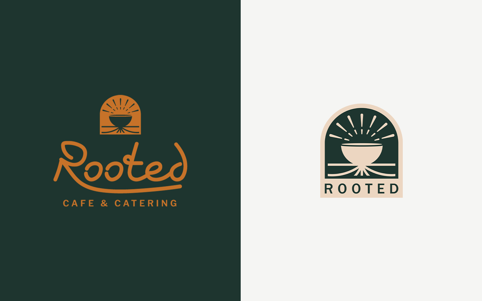
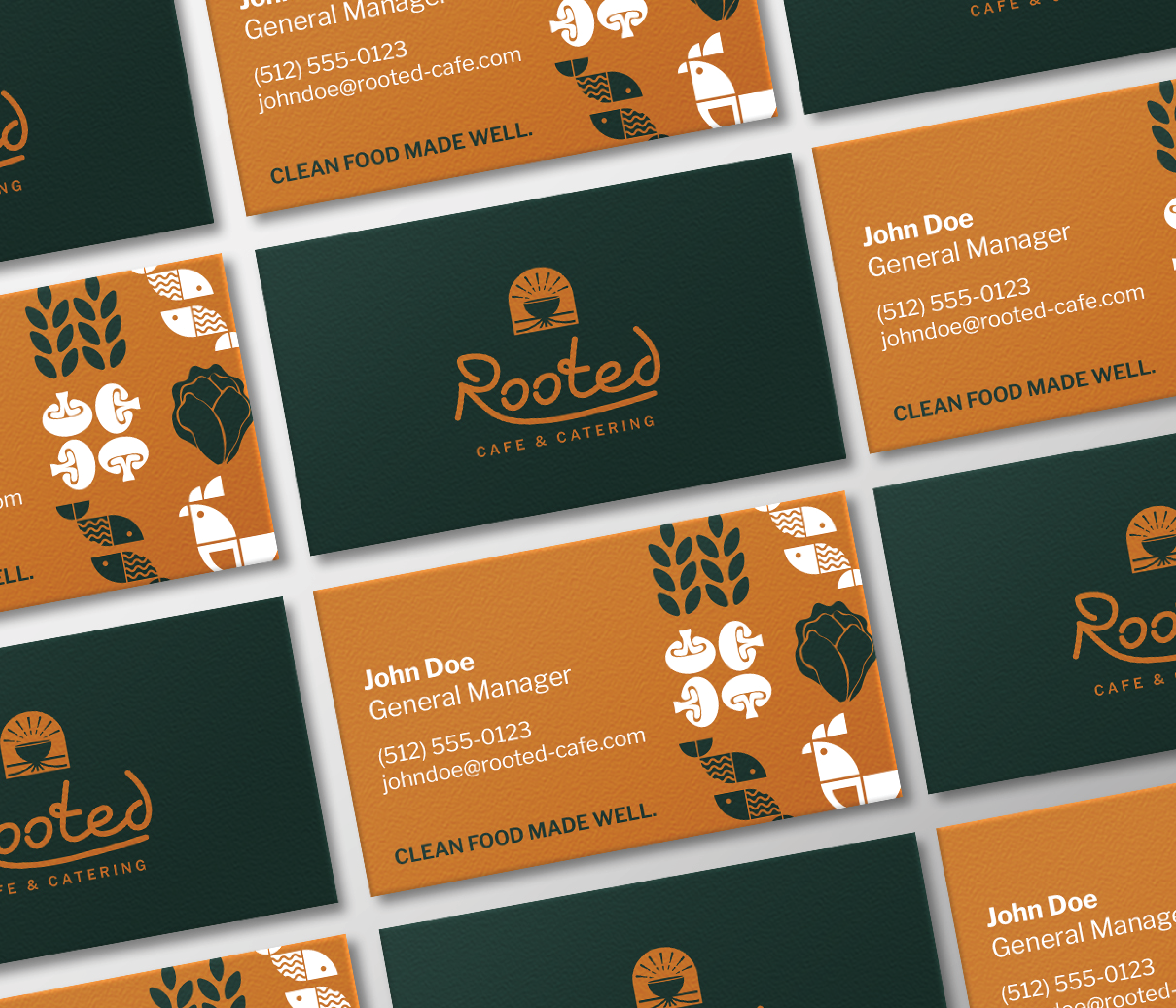
The Rooted identity pairs an expressive hand-drawn wordmark with a simple emblem, creating a mark that feels personal, crafted, and connected to the café experience.
Color & Typography
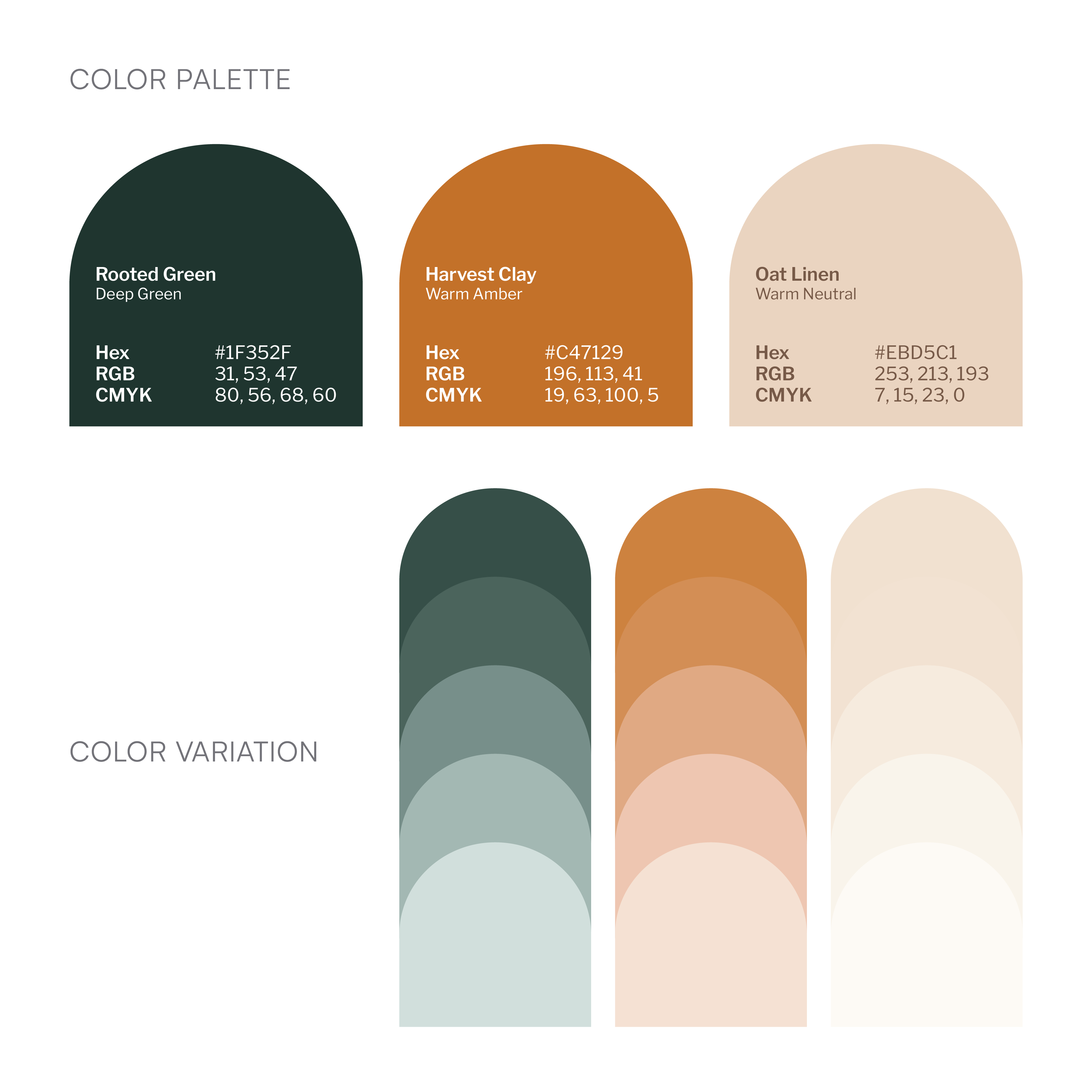
The visual language combines grounded greens, warm clay, and soft neutrals to create an identity that feels natural without becoming overly rustic.
Rooted Green provides the foundation while Harvest Clay introduces warmth and energy. Warm Oat gives the system space to breathe.
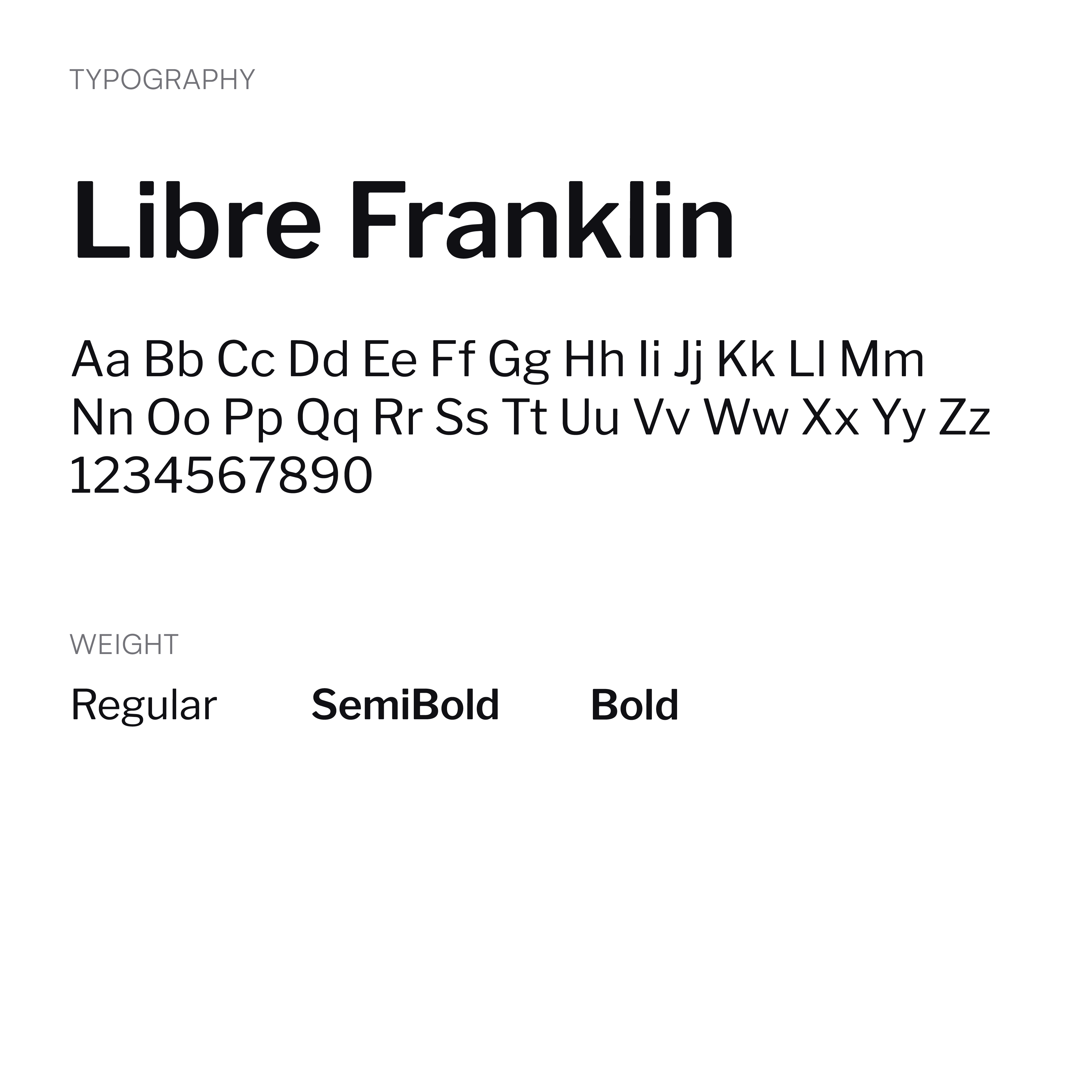
Libre Franklin provides a clear and flexible typographic foundation across the brand.
Applications
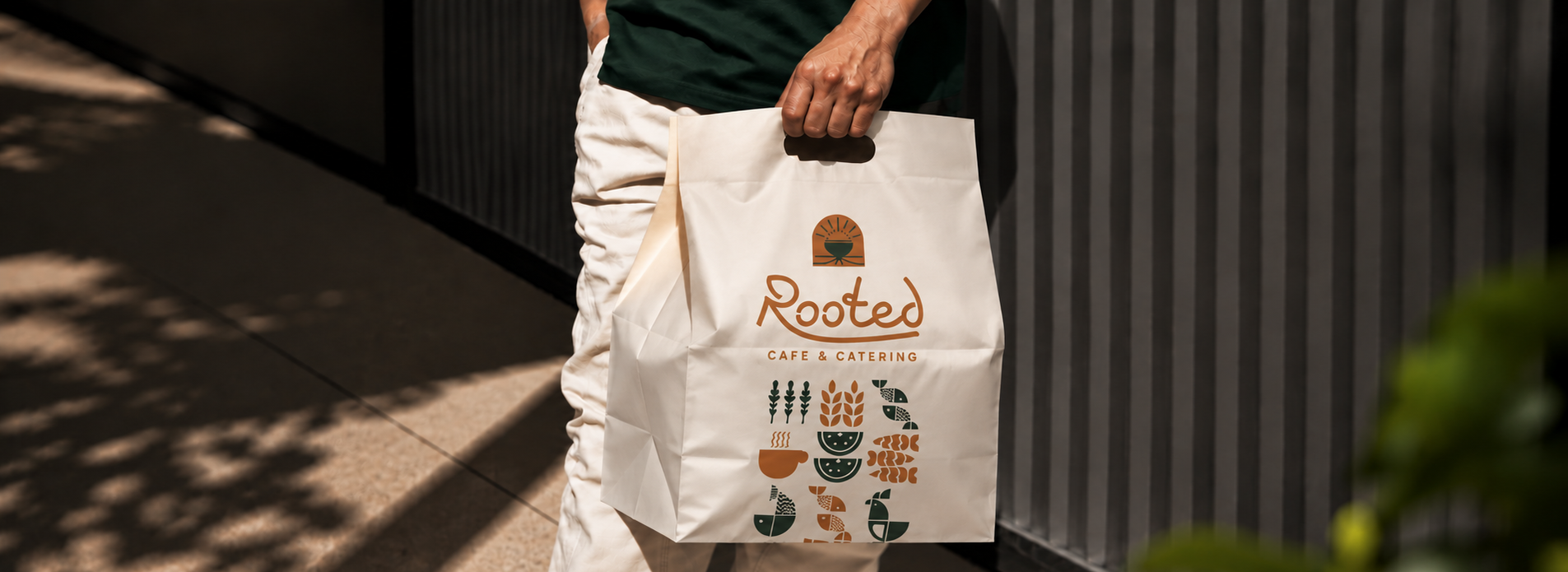
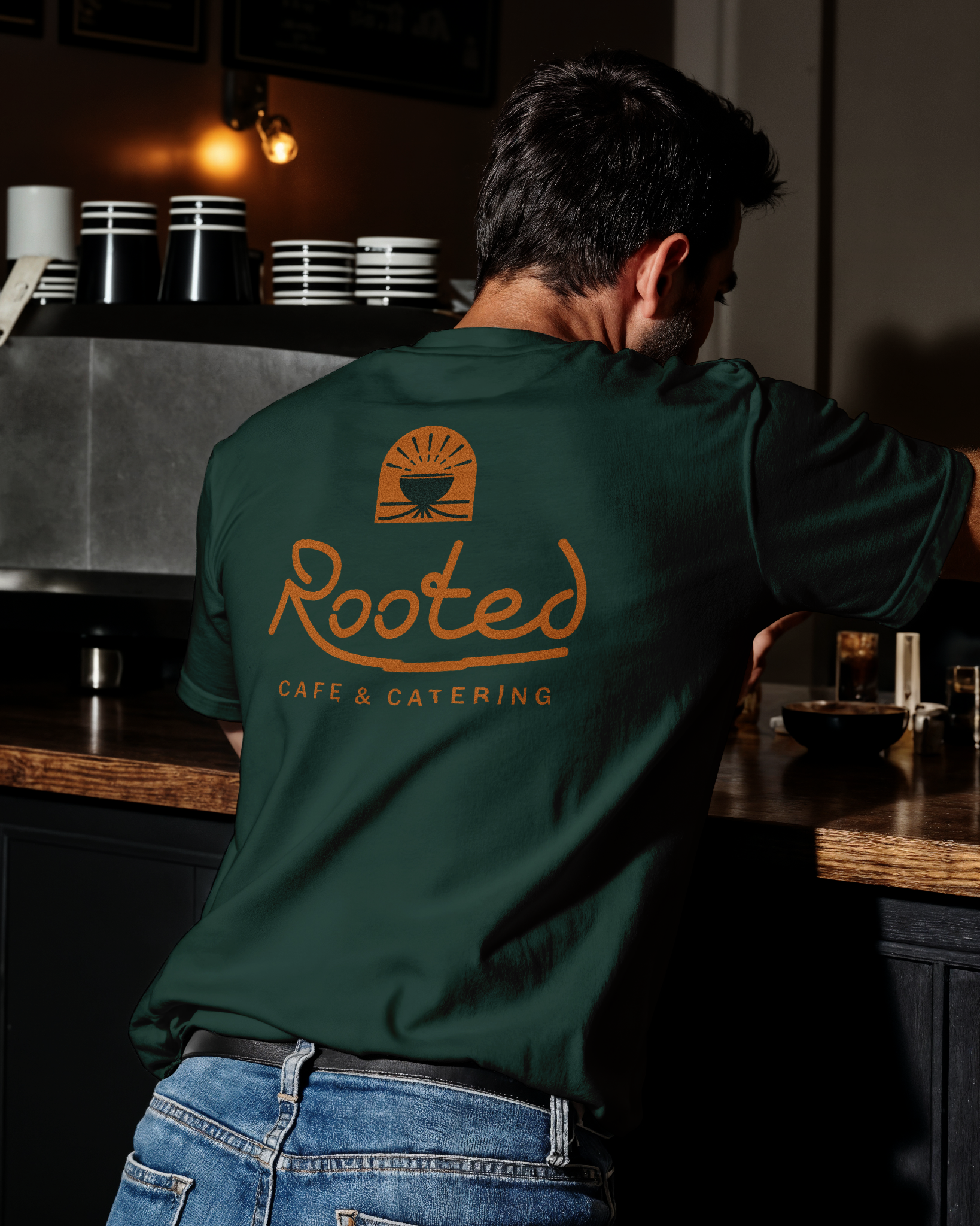
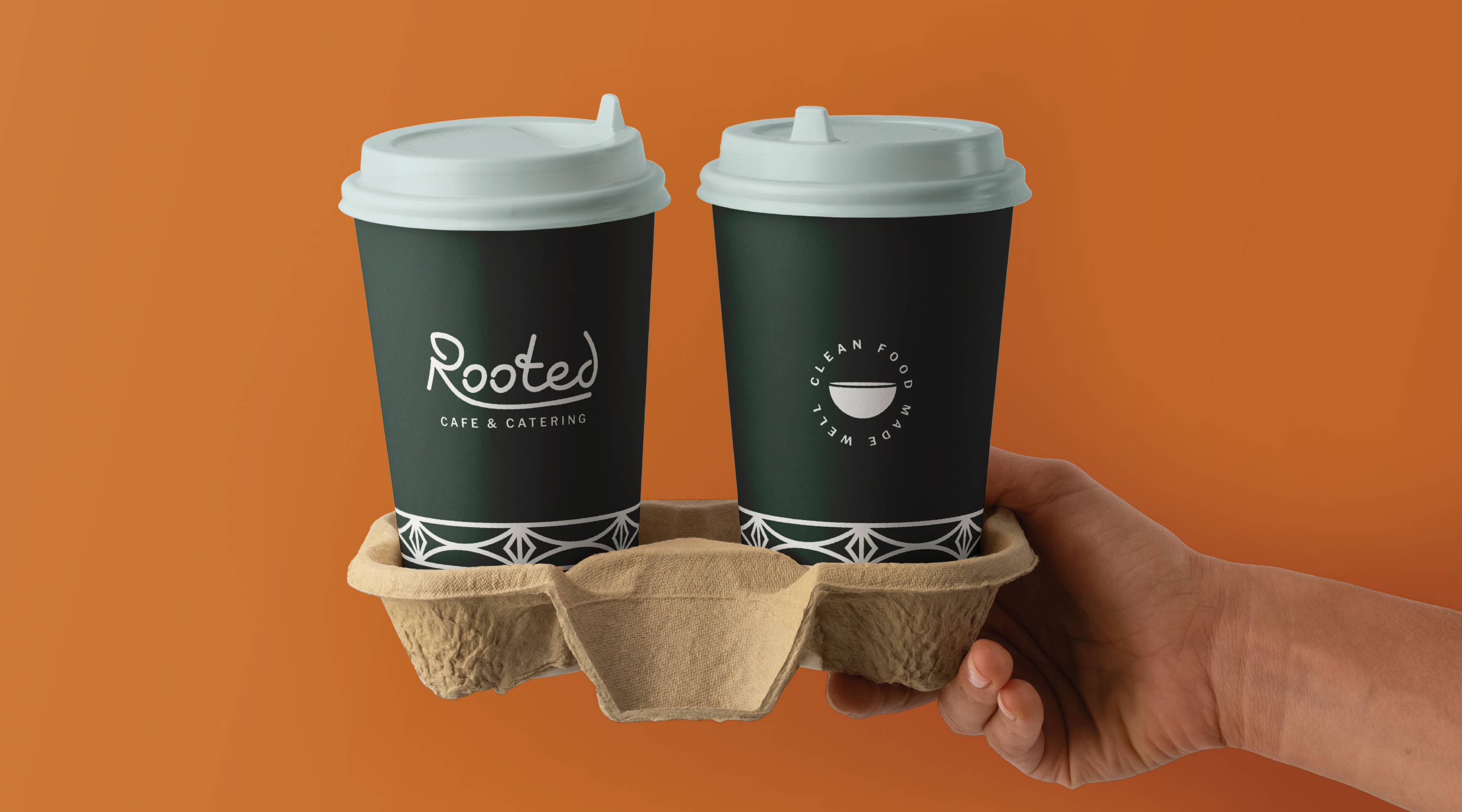
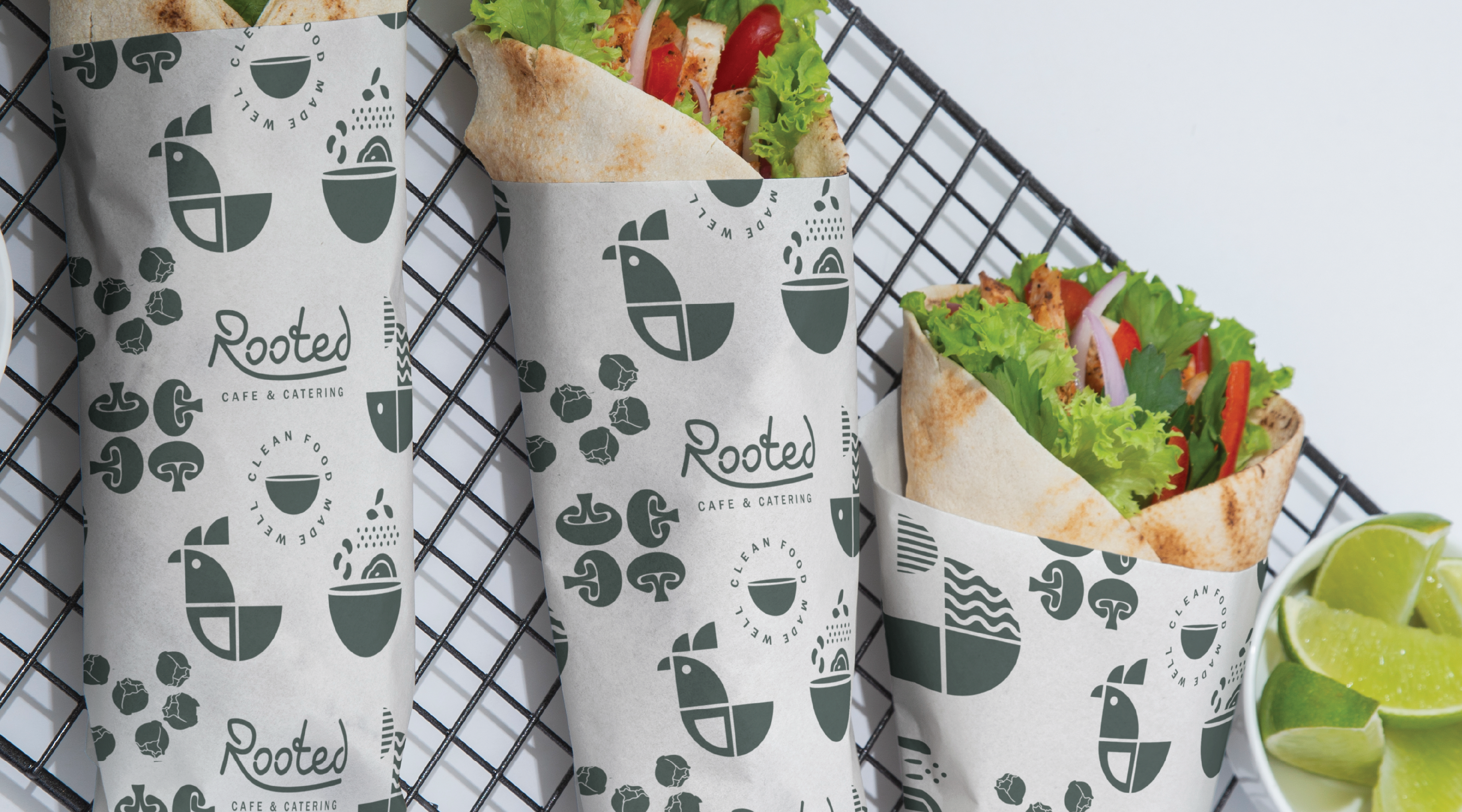
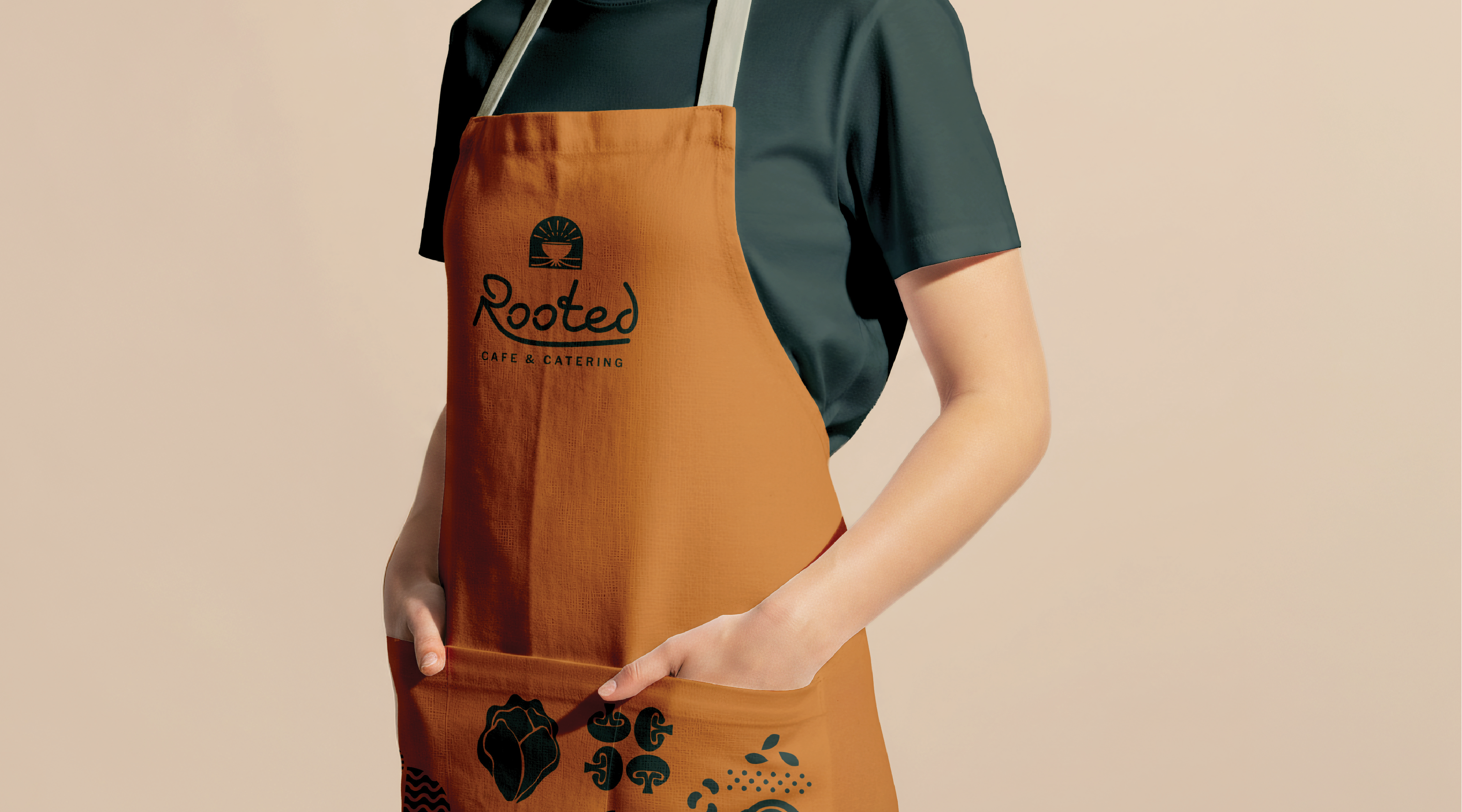
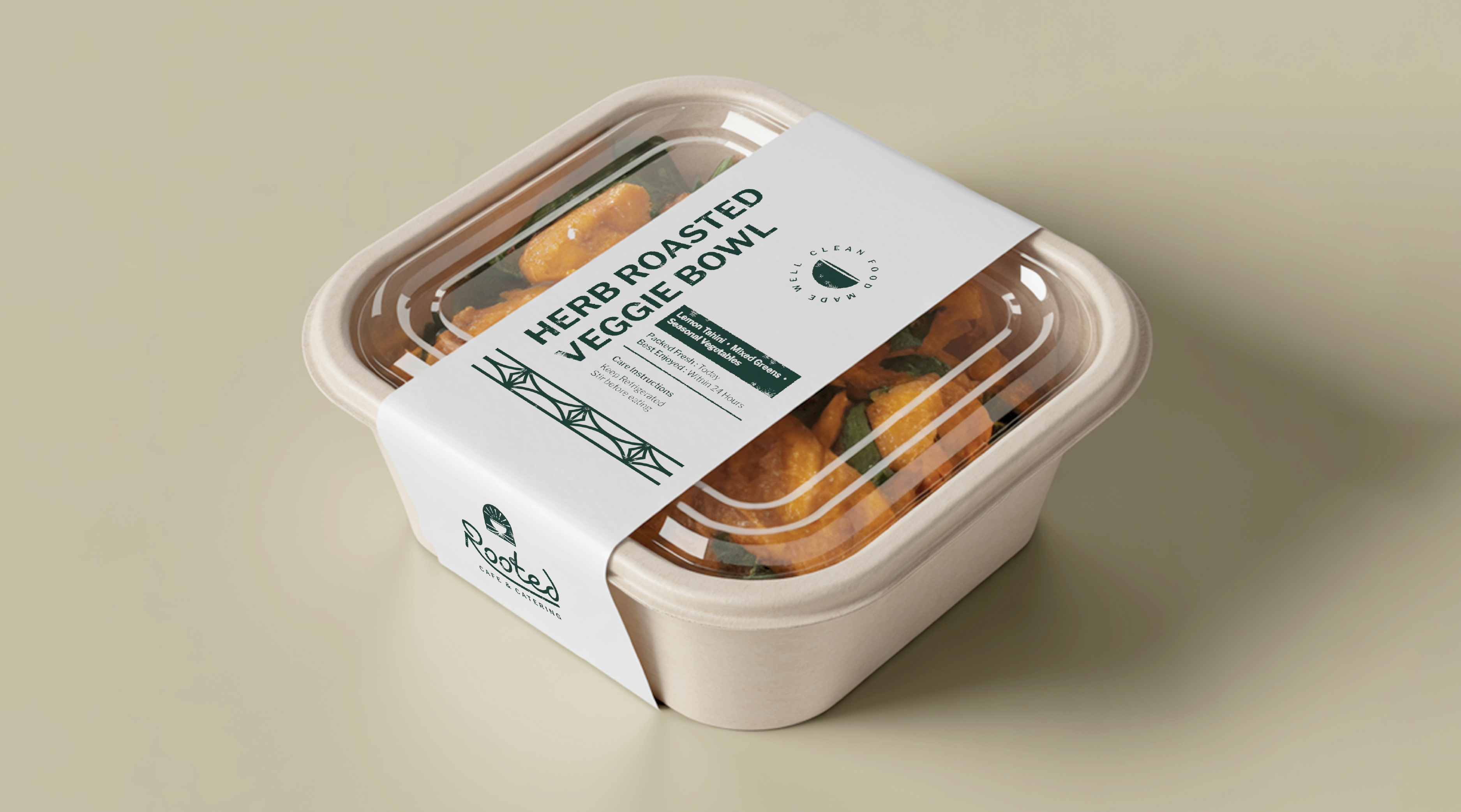
The identity is designed to live naturally across apparel, café materials, signage, and other customer touchpoints, turning the brand into part of the physical experience.
Digital & Visual System
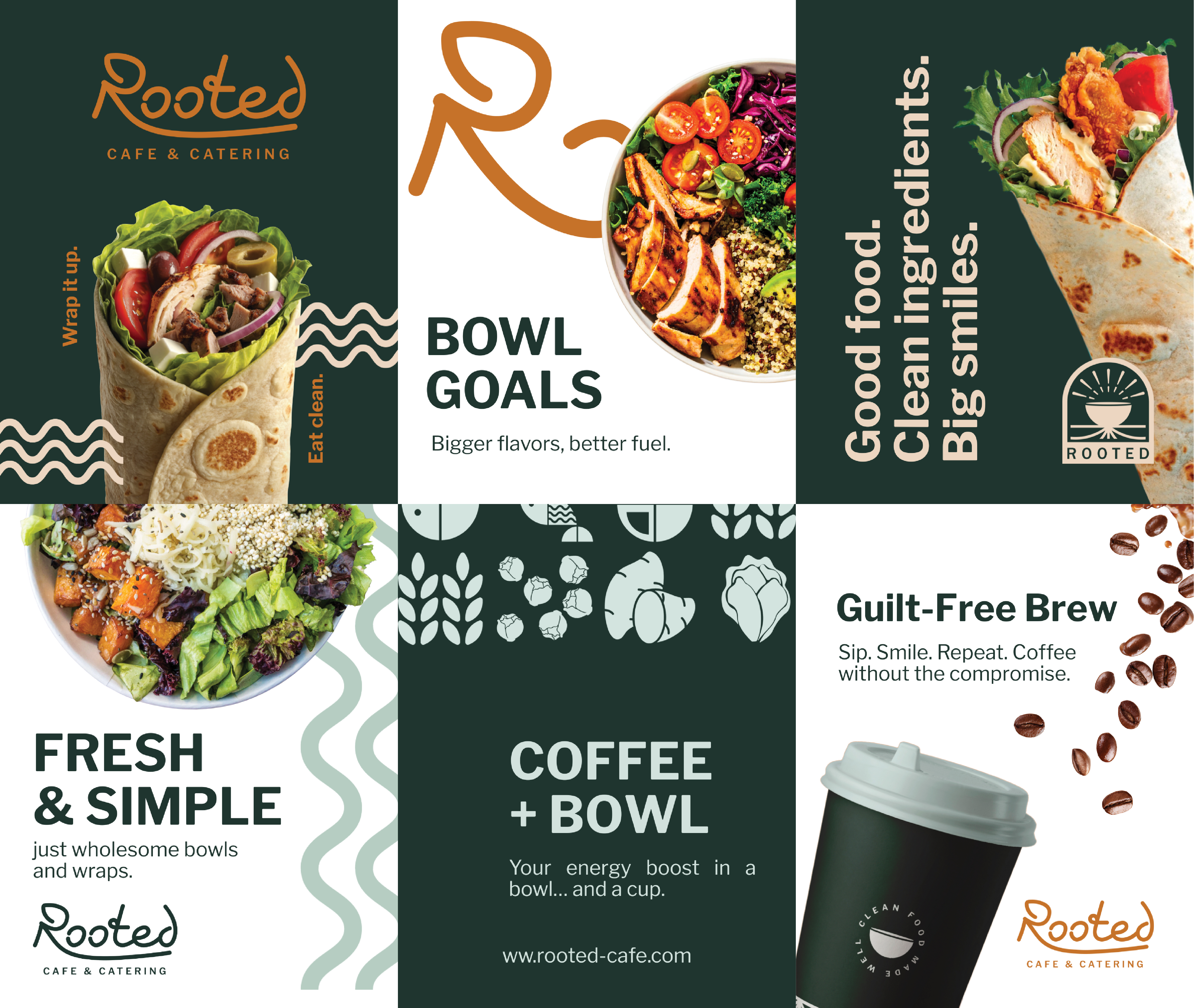
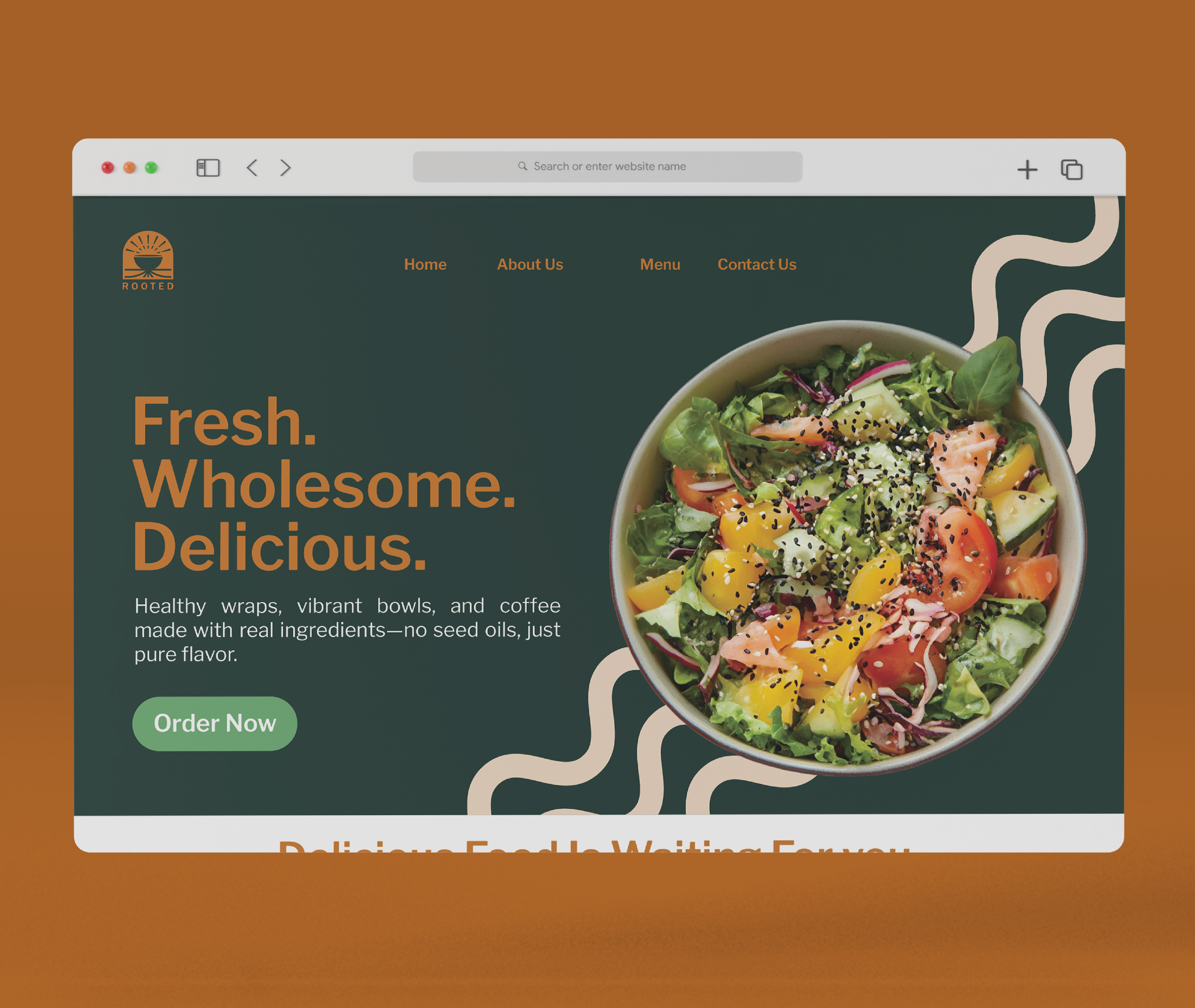
The identity carries into digital communication through social content, promotional graphics, and web applications.
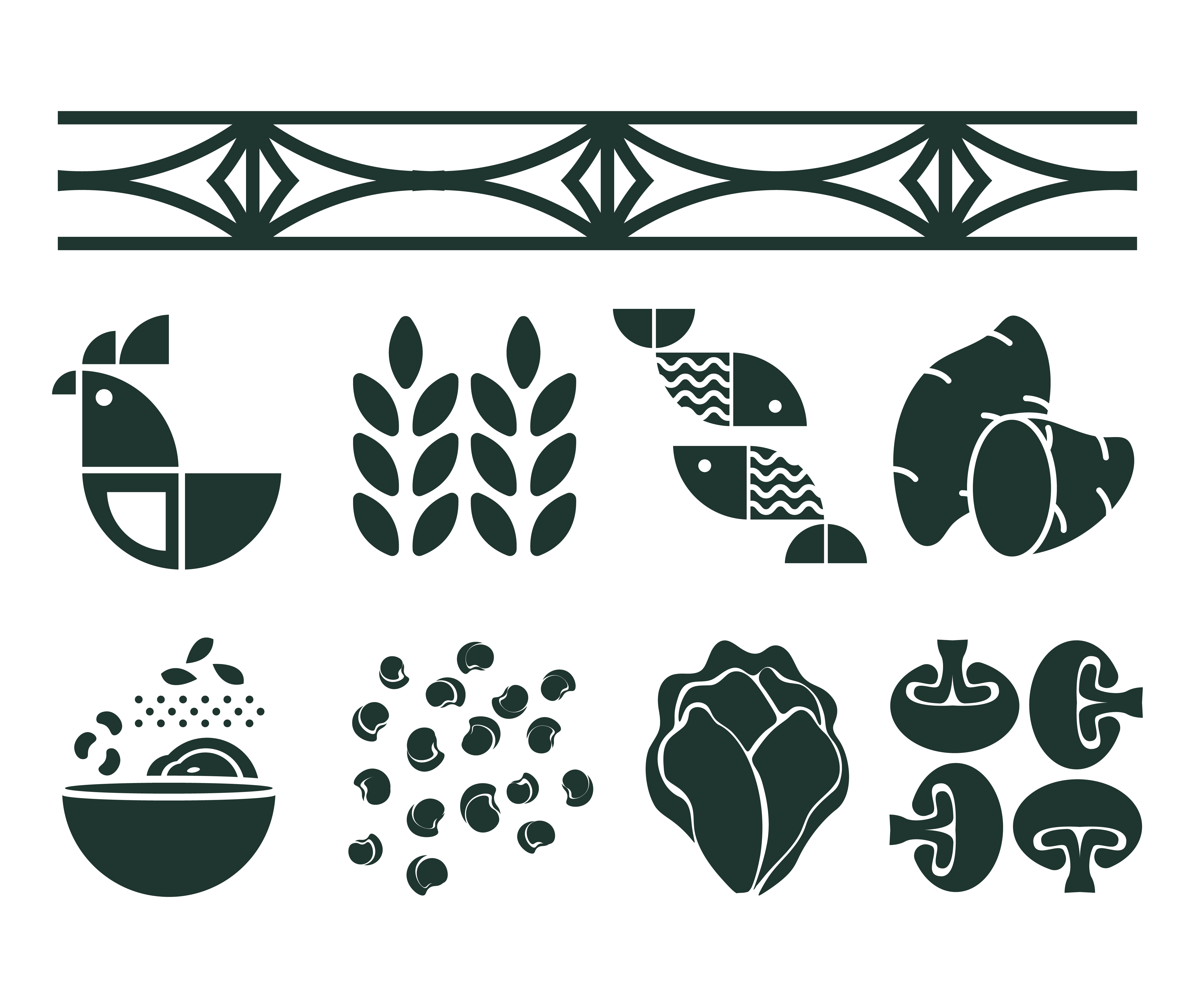
Supporting illustrations, patterns, and food-inspired graphics add flexibility while keeping the Rooted identity recognizable.