Sachi
A modern financial brand built around clarity, growth, and good fortune. The identity combines a distinctive floral emblem with a confident teal and orange visual system designed to feel approachable, optimistic, and refined.

Logo & Identity
The Sachi identity is built around a distinctive floral emblem inspired by the meaning of sachi, a Japanese word associated with happiness and good fortune.
Eight interwoven S shapes form a symbol that suggests a flower of fortune and a sun of renewal. The identity pairs this expressive mark with a clean wordmark, creating a balance between personality and professionalism.

Color & Typography
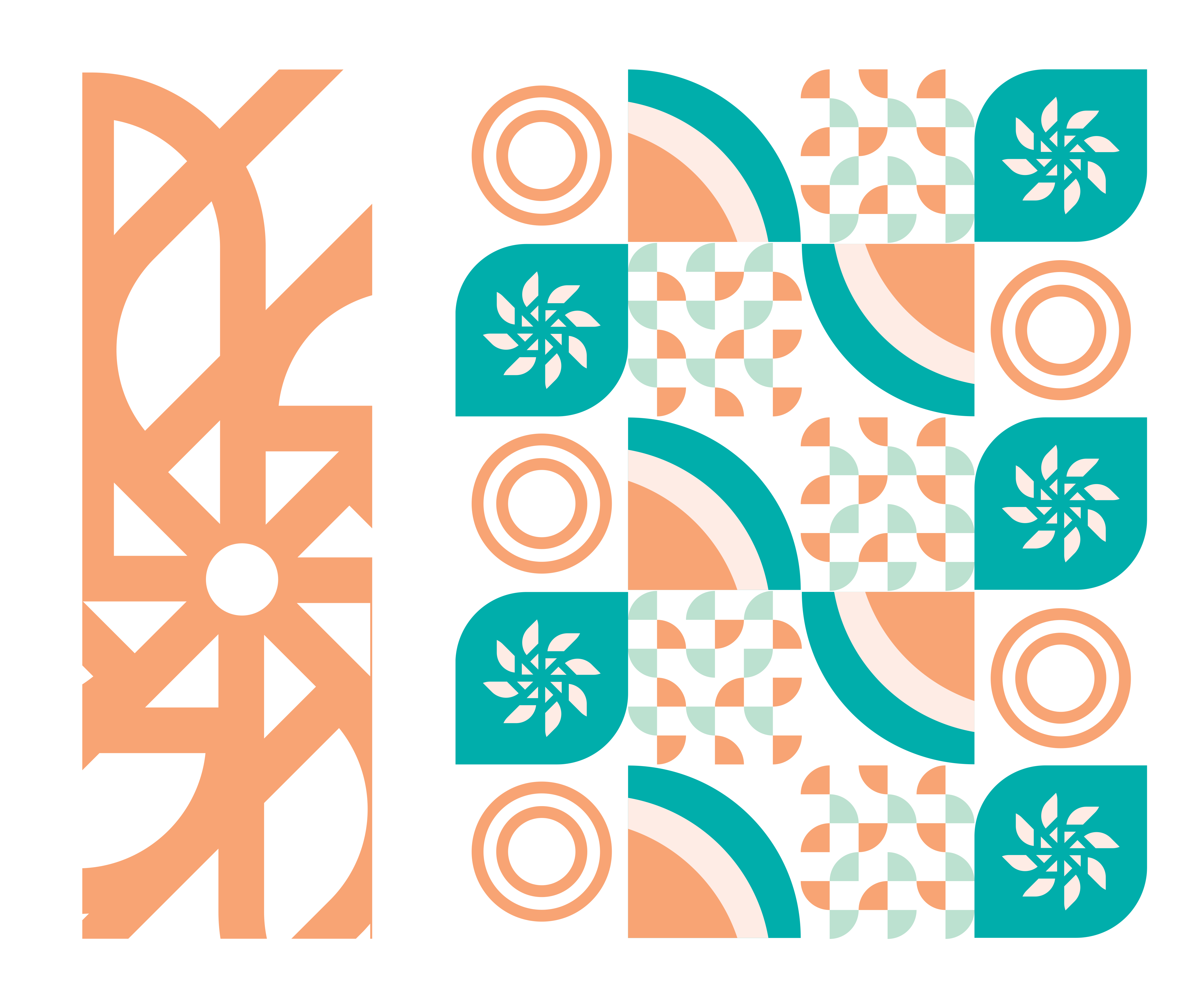
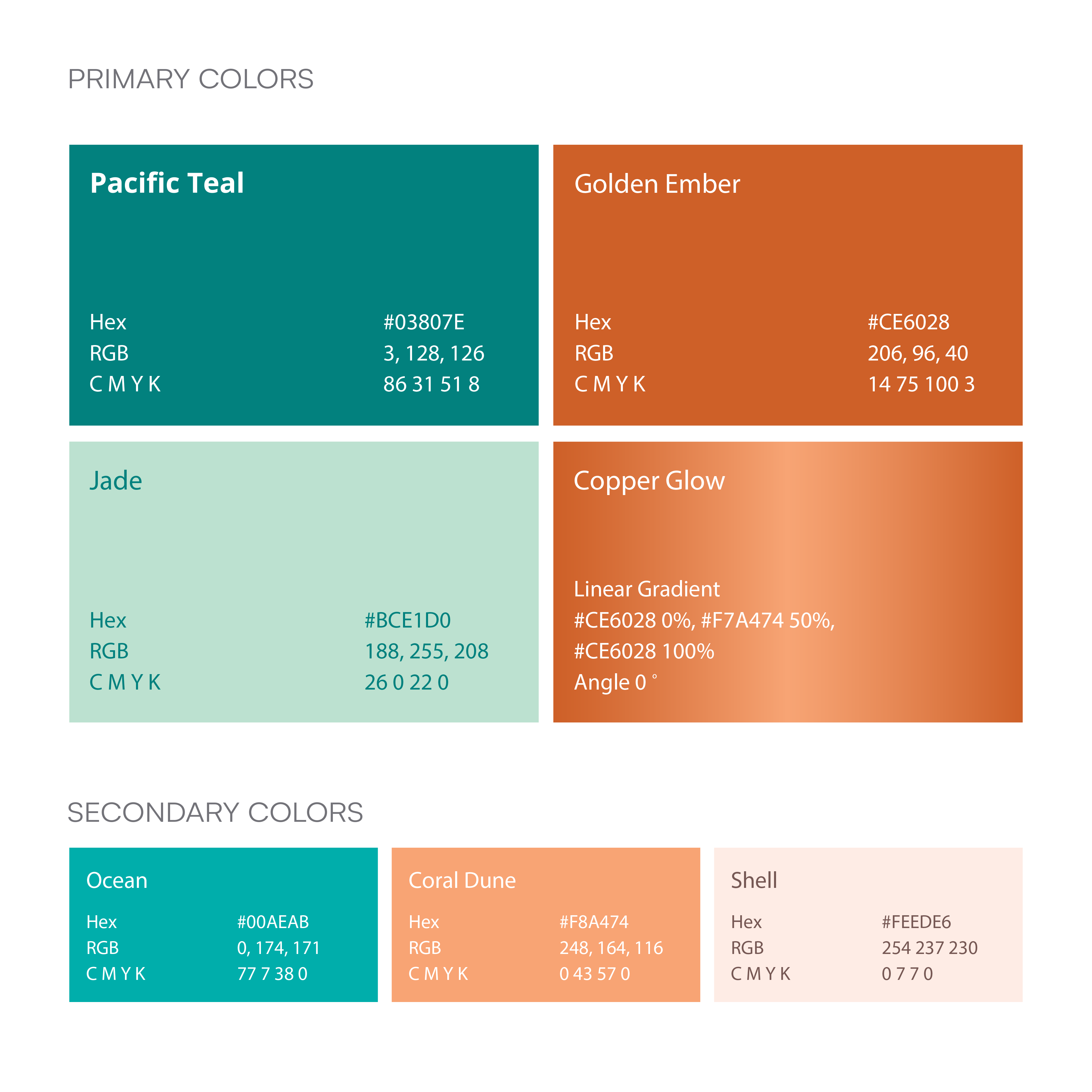
The visual language balances confident teal with warm orange tones to create a brand that feels established without becoming overly corporate.
Pacific Teal provides the foundation, while Golden Ember brings warmth and energy to key moments. Copper Glow adds a subtle premium accent through its gradient treatment.
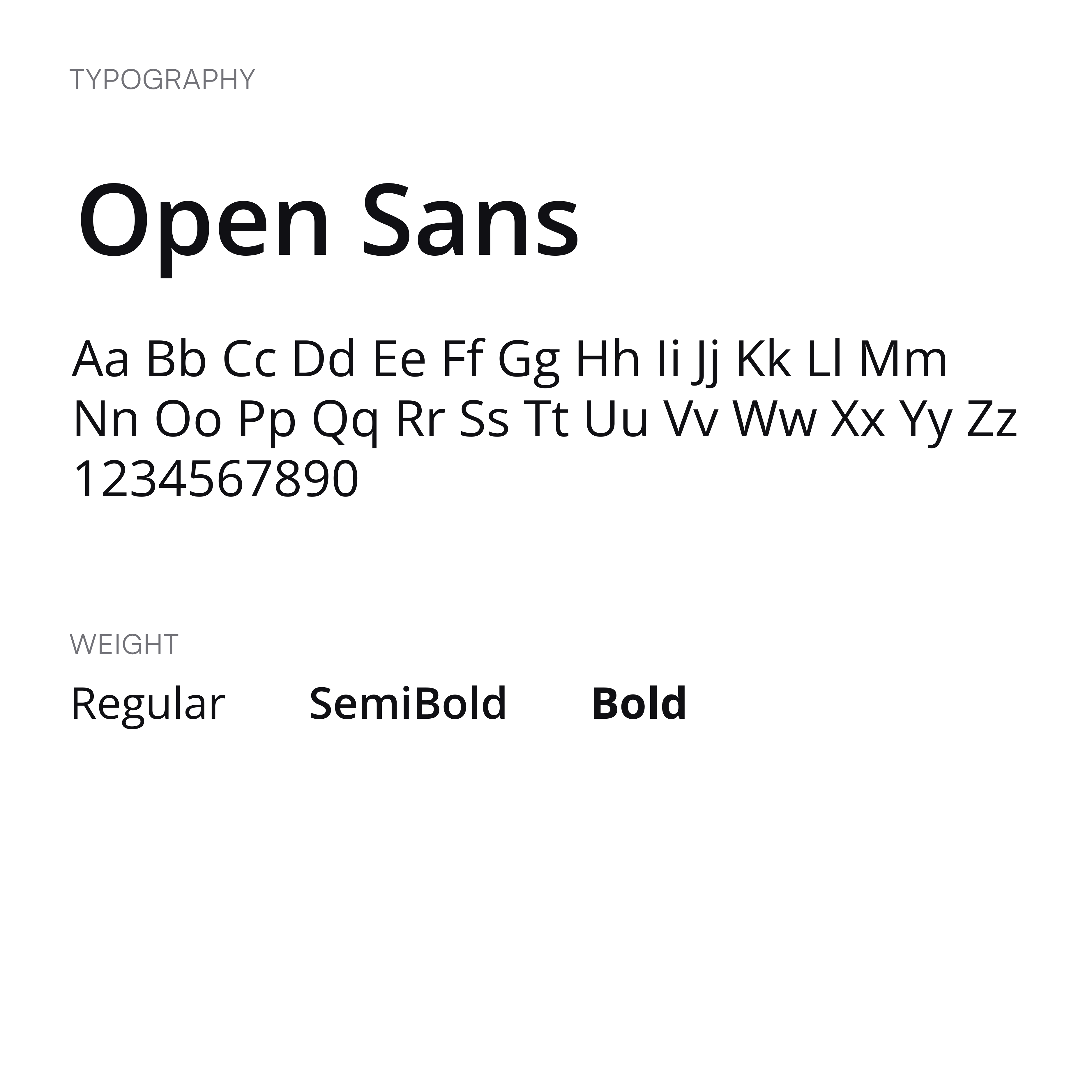
Open Sans keeps the system clean and accessible, giving the identity a consistent typographic foundation across print and digital applications.
Brand Applications
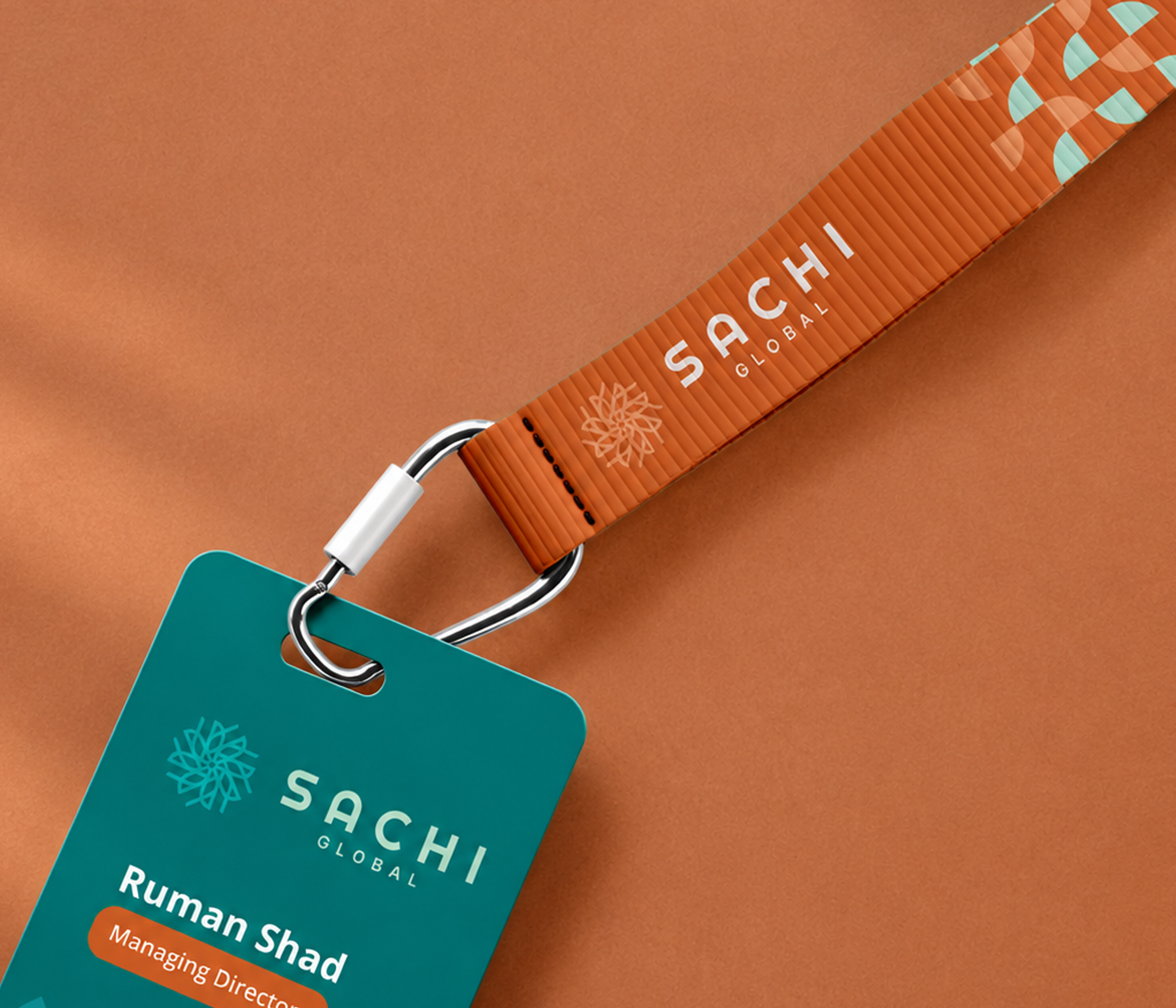
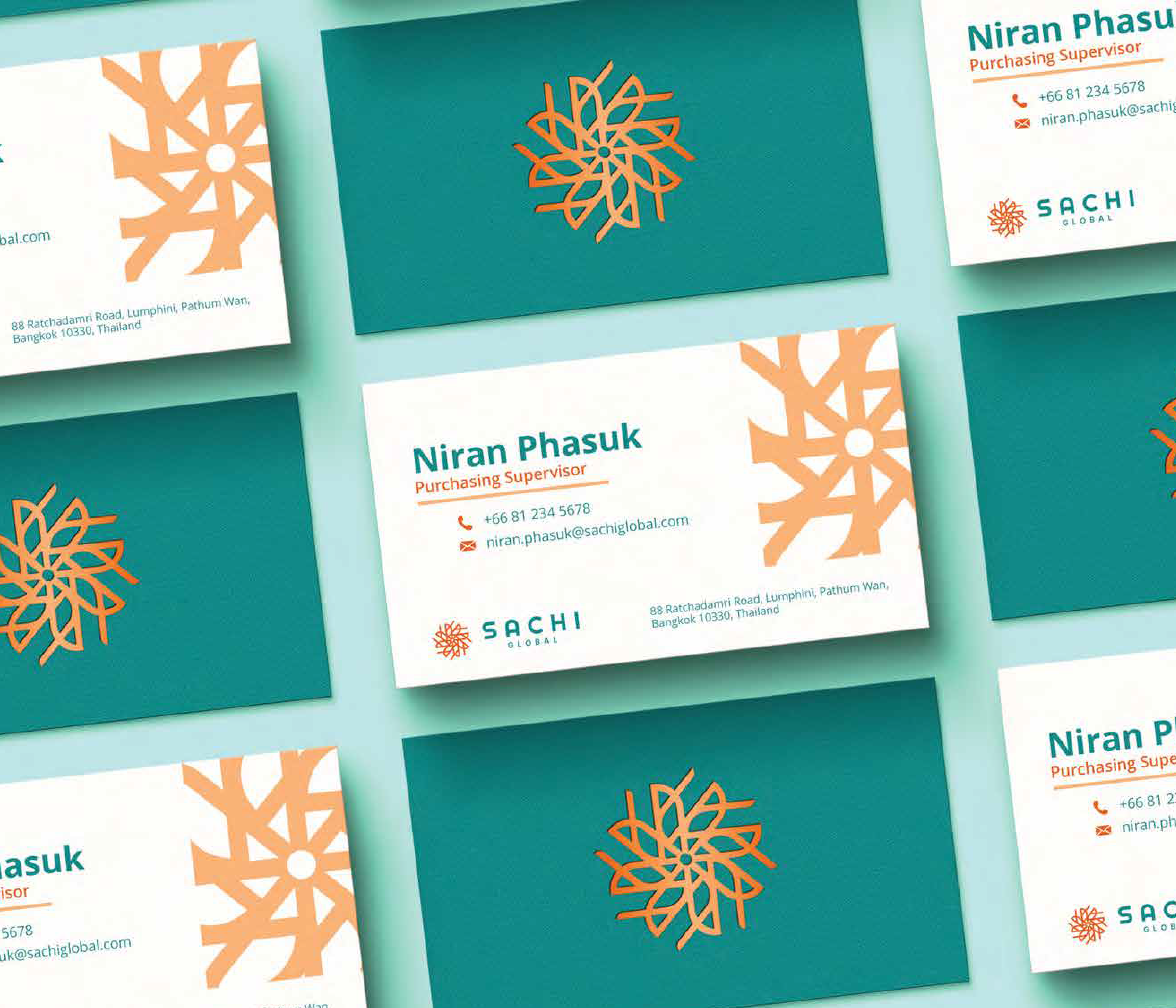
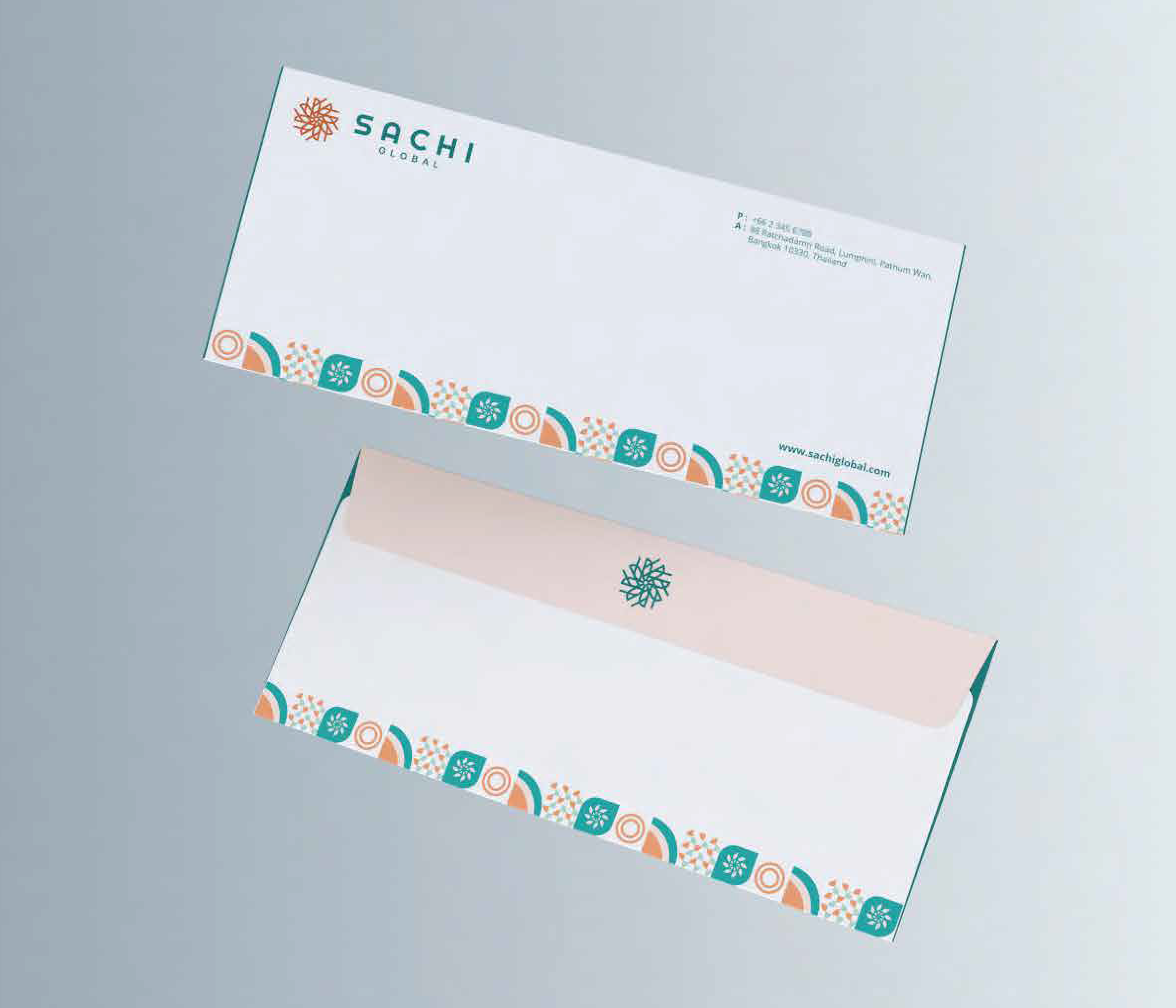
The identity was extended across stationery and everyday brand touchpoints, creating a consistent visual language beyond the logo.
From business cards and letterheads to envelopes and supporting materials, the system uses color, typography, and the Sachi emblem to create a recognizable and cohesive brand presence.


Digital & Social
The visual system was designed to work just as naturally on screen as it does in print.
The website and social content bring together strong typography, photography, graphic elements, and the Sachi pattern to create a digital presence that feels clear, confident, and consistent.