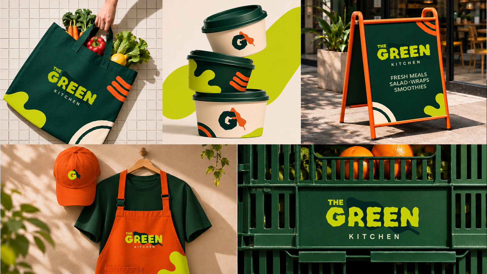
The Green Kitchen
A healthy kitchen built around good food and brighter days. The identity uses a bold, energetic visual language, combining deep green, vibrant lime, and punchy orange with playful food-inspired graphics and expressive typography. The result is a fresh, approachable brand that brings personality to everyday healthy eating.
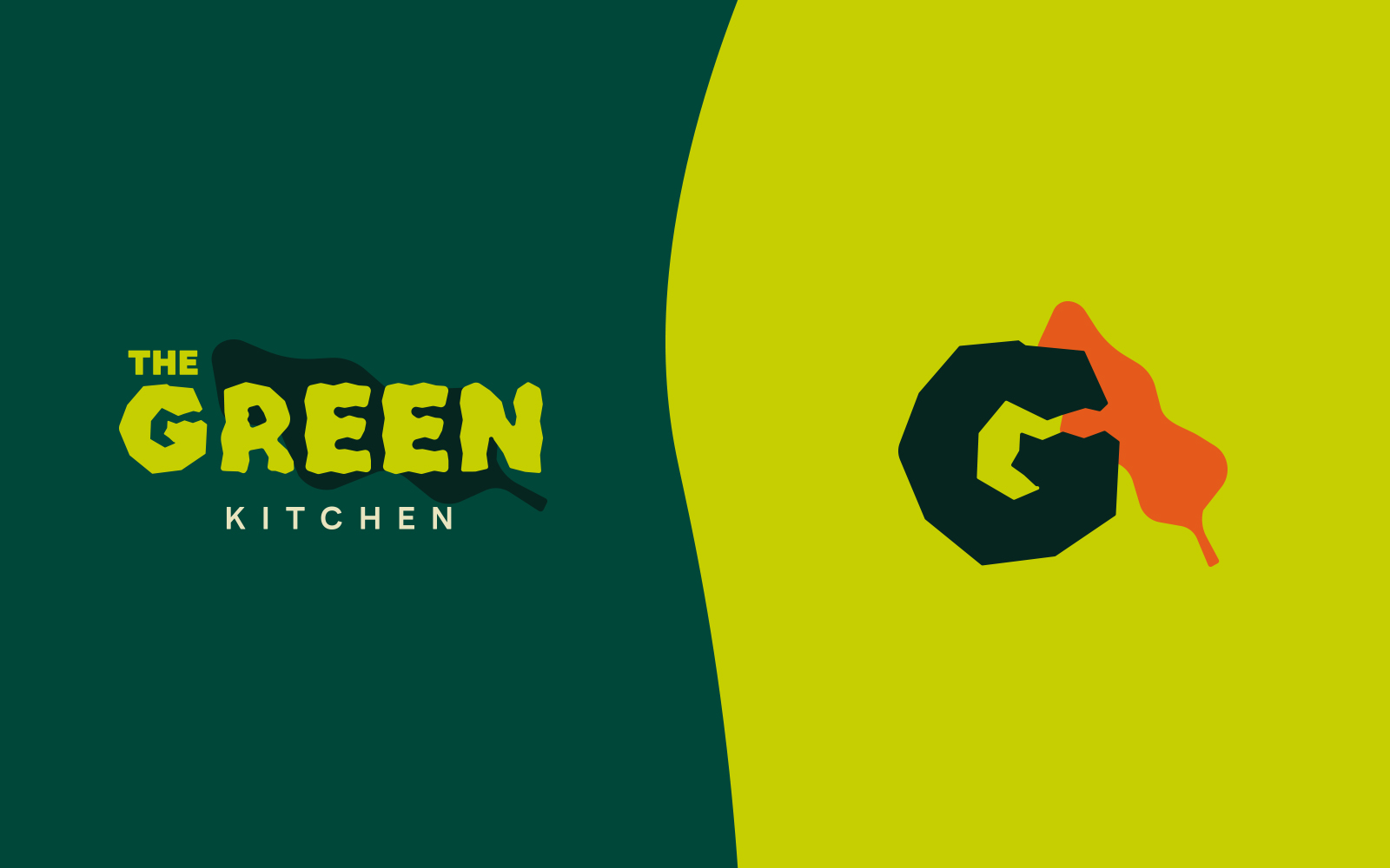
Logo & Identity
The identity pairs a bold, hand-drawn wordmark with a distinctive graphic G symbol. Its chunky lettering, organic shapes, and vibrant color combinations give the brand an energetic and playful personality while keeping it recognizable across different applications.
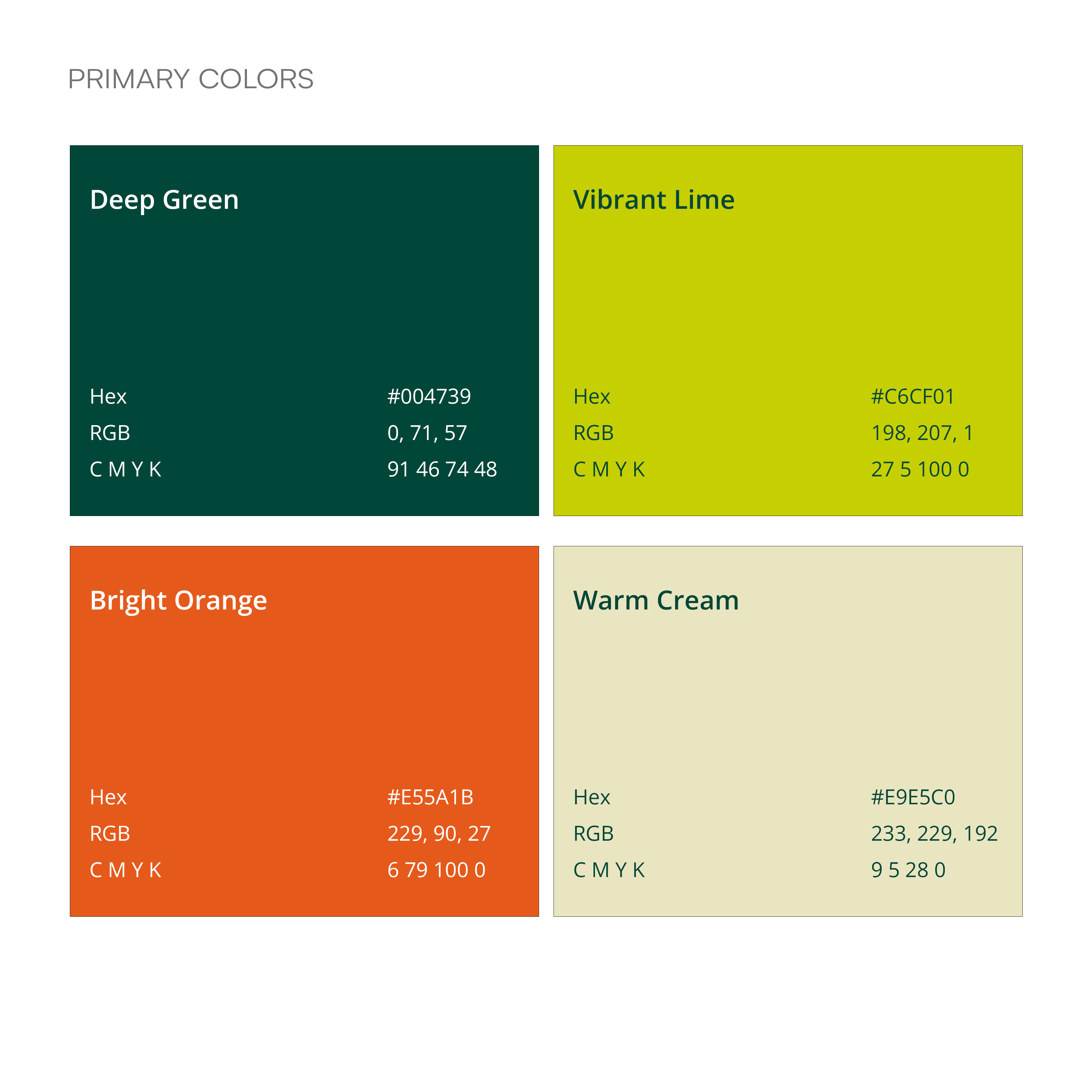
Color & Typography
The visual identity uses a bold combination of deep green, vibrant lime, bright orange, and warm cream. These contrasting colors bring energy and playfulness to the brand, creating a distinctive look across its applications.
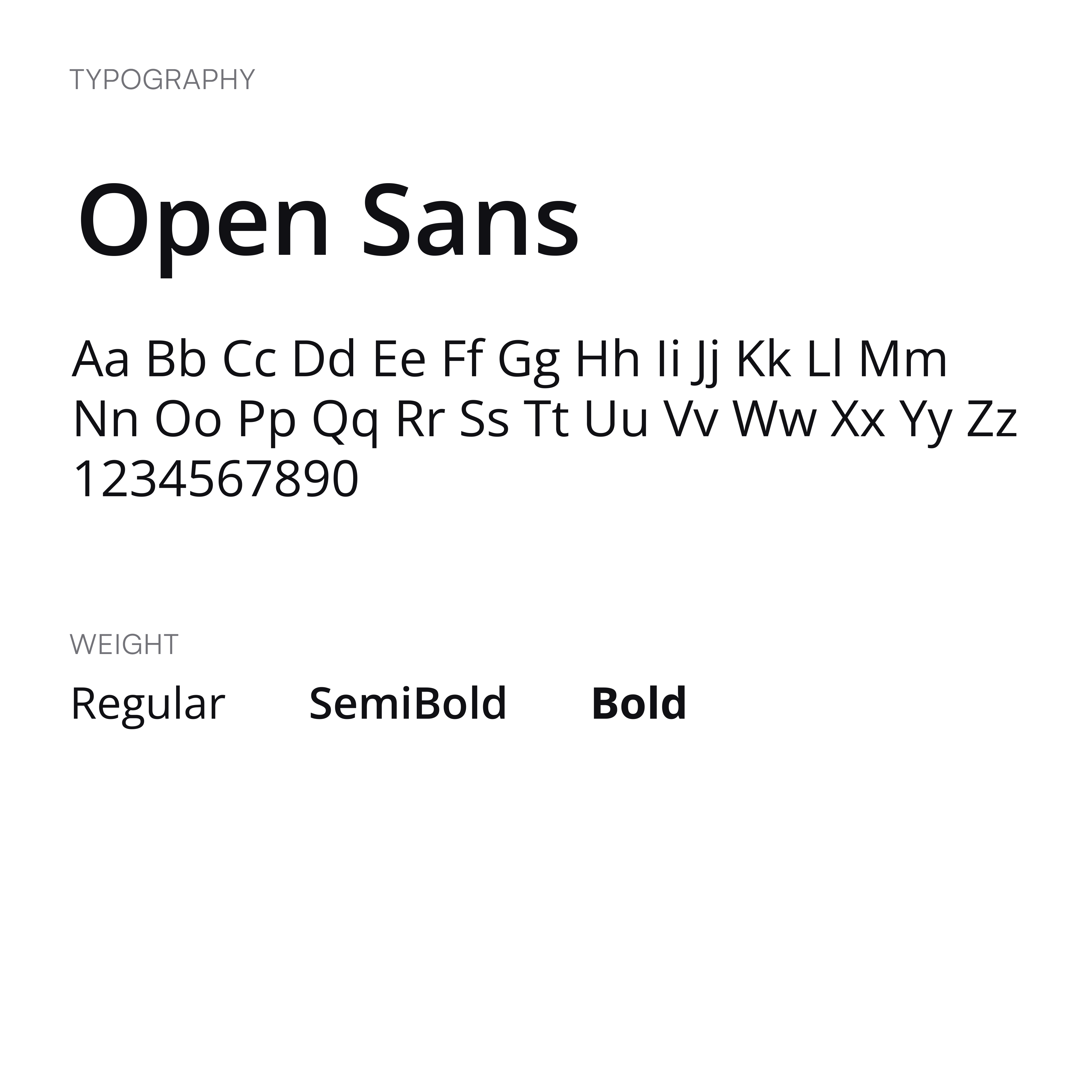
To balance the expressive logo, the typography stays simple with Open Sans in Regular, SemiBold, and Bold weights. This keeps supporting text clean, readable, and consistent without competing with the personality of the main identity.
Packaging
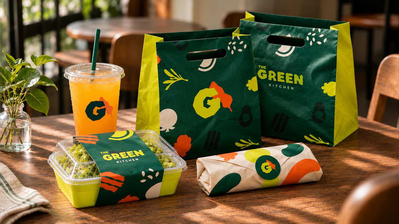
The packaging brings the identity to life through bold color blocking, playful food-inspired graphics, and textured materials. Consistent use of the brand colors, organic shapes, and typography creates a cohesive and recognizable look across every product.
Applications
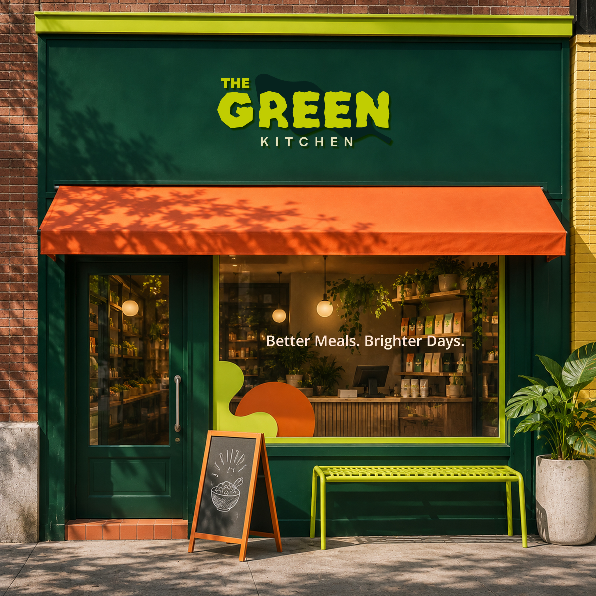
The visual identity carries beyond packaging into everyday brand touchpoints, from promotional materials and staff apparel to storefront signage and lifestyle items. Consistent colors, playful graphics, and bold shapes keep the brand recognizable wherever it appears.