Goodies
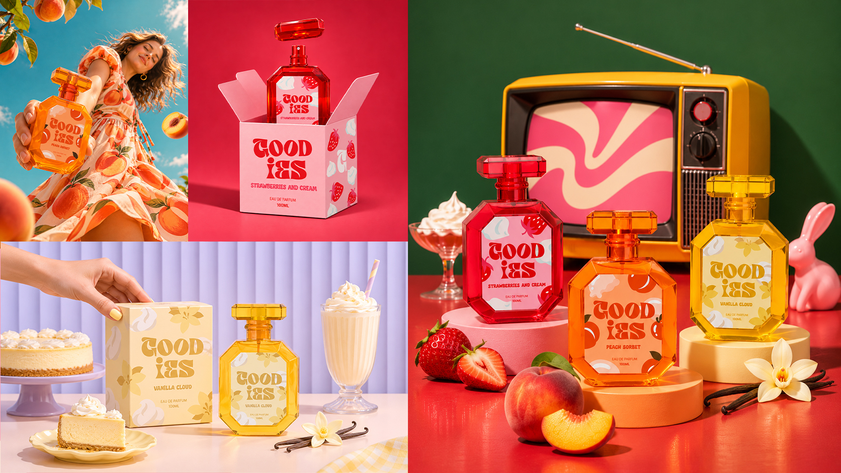
Goodies embraces a cheerful, indulgent personality inspired by the playful world of sweet treats. The direction pairs bold, expressive lettering with simple forms and flavor-inspired graphics, creating a flexible visual system that feels fun, youthful, and recognizable across products and campaigns.
Brand Direction
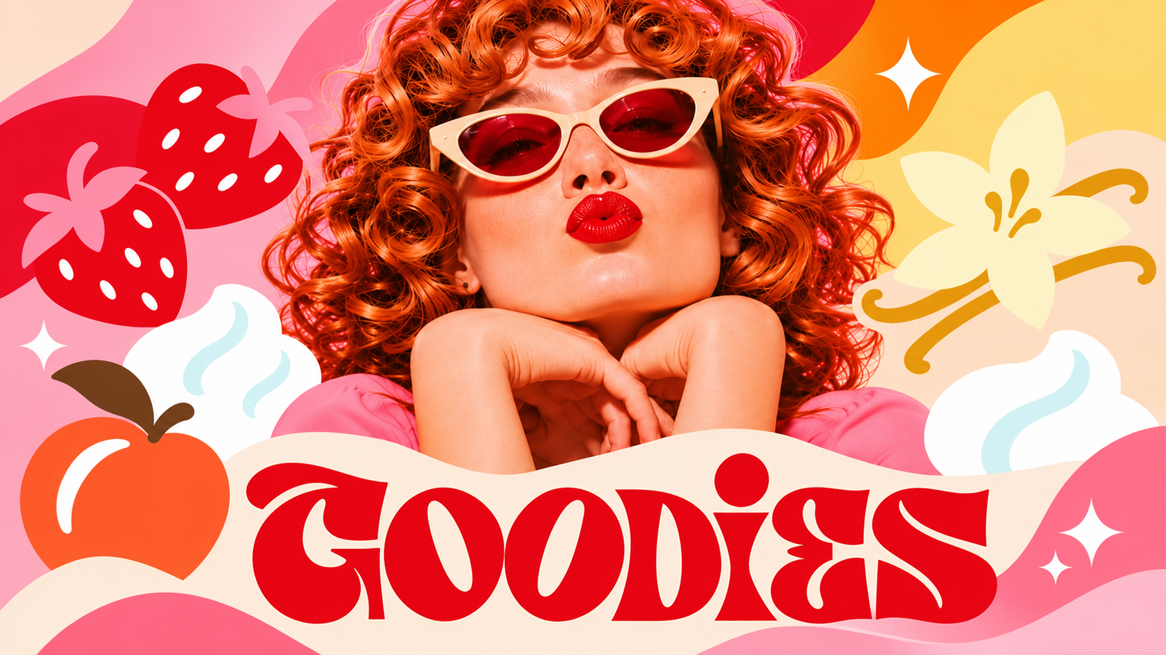
Goodies embraces a playful, retro-inspired personality built around bold lettering, expressive colors, and nostalgic visual elements. Drawing inspiration from vintage beauty campaigns and the indulgent world of sweet treats, the identity creates a cheerful and distinctive look that carries across products, packaging, and promotional campaigns.
Packaging System
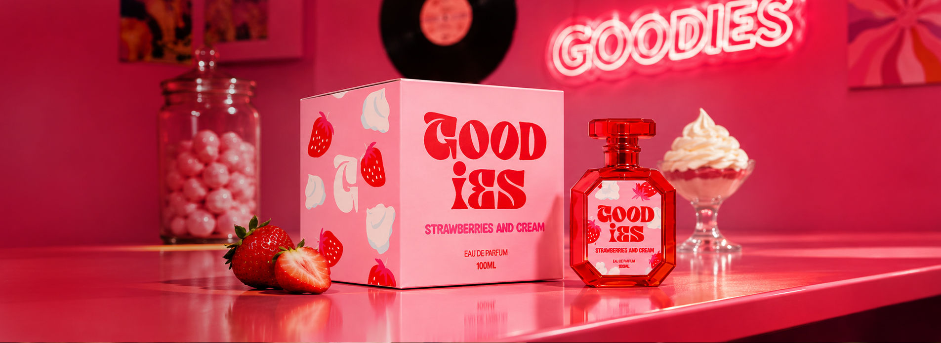
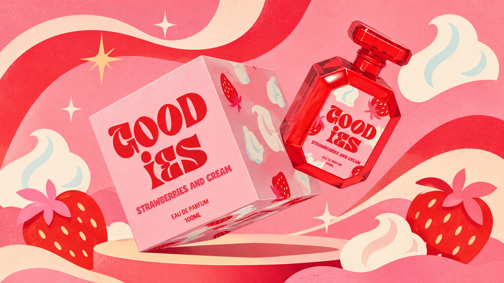
The packaging brings the playful identity into the product itself through bold color combinations, expressive typography, and scent-inspired illustrations. Each fragrance has its own visual personality while sharing a consistent design language, creating a collection that feels cohesive, distinctive, and hard to miss.
Brand Applications
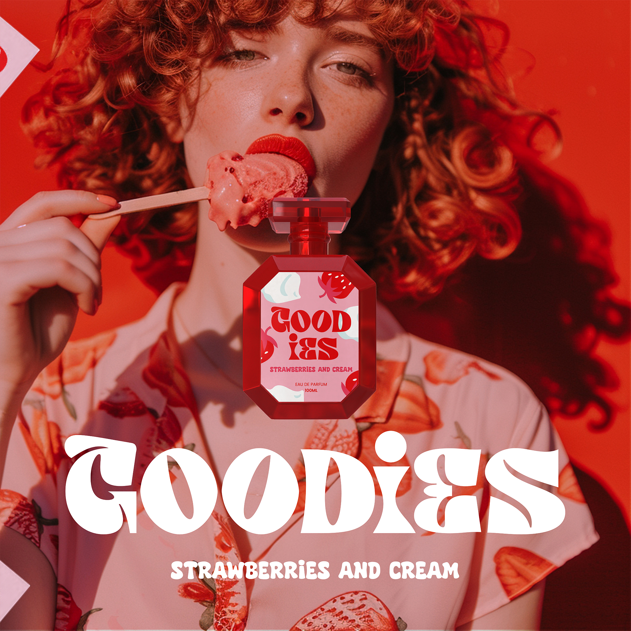
The Goodies identity comes to life through playful campaign visuals and expressive product photography. Each composition draws on the personality of its scent, combining bold colors, distinctive styling, and playful graphic elements to create a consistent visual experience across the brand.